THE CORNER
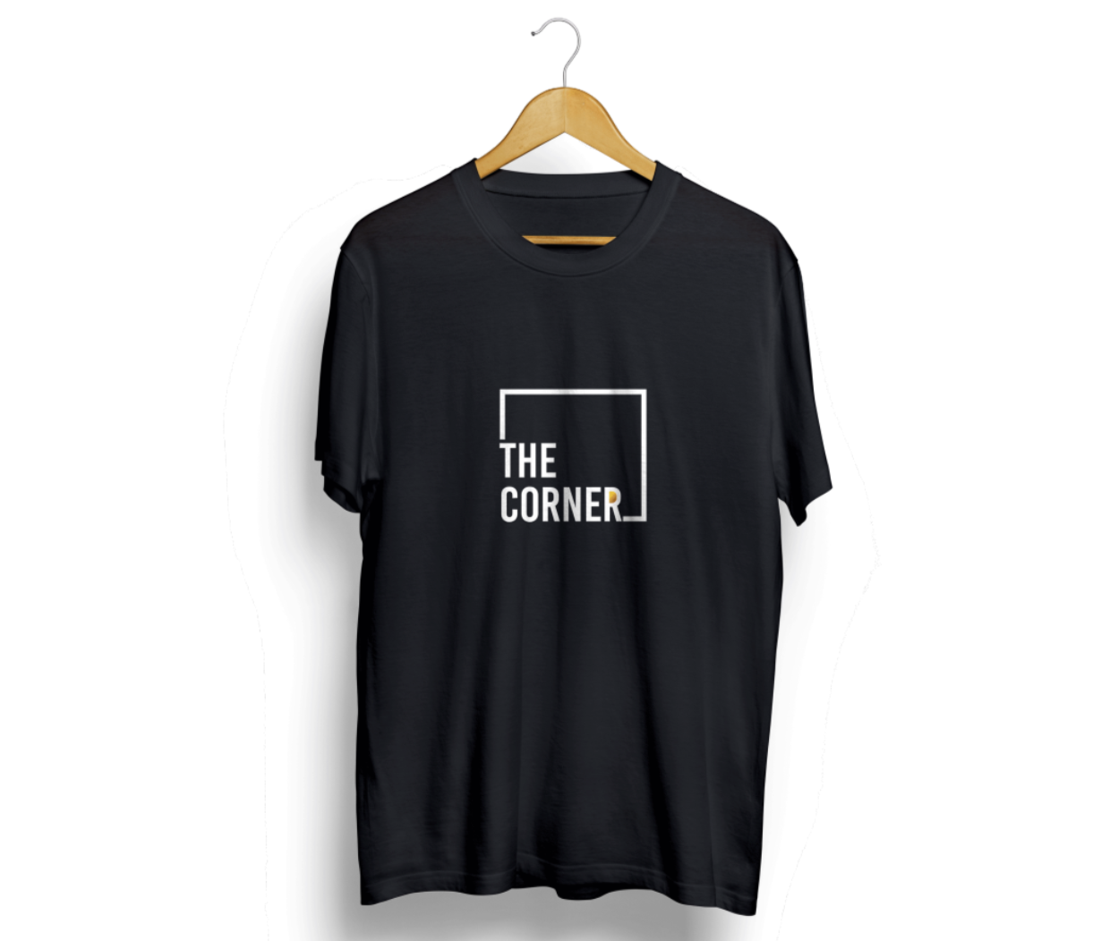
The Corner is an African outdoor restaurant and bar with a pop culture. The brands core value proposition is being different in terms of service and aesthetics its meant to convey this luxury message but also simple, the logo has a minimalist design with 2 colours.
Client
[ The Corner ]role
[ Branding and Identity ]Time Line
[ may 2020 - July 2020 ]The Ask
The Corner is an African outdoor restaurant and bar that blends a vibrant pop culture atmosphere with a luxurious yet simple aesthetic. Our core value proposition is to stand out through exceptional service and unique visual appeal. We seek a brand identity and minimalist logo design that convey this luxury and simplicity using a two-color palette. The design should subtly reflect our African roots while resonating with a modern, trendy audience. Our goal is to create a strong, recognizable brand that differentiates The Corner from competitors, appealing to young professionals and pop culture enthusiasts who value a unique and relaxed dining experience.
The Design
To establish a strong, recognizable brand identity that differentiates The Corner from other restaurants and bars. To convey a sense of luxury that is accessible and not overly extravagant. To create a cohesive visual identity that can be consistently applied across all marketing and branding materials.
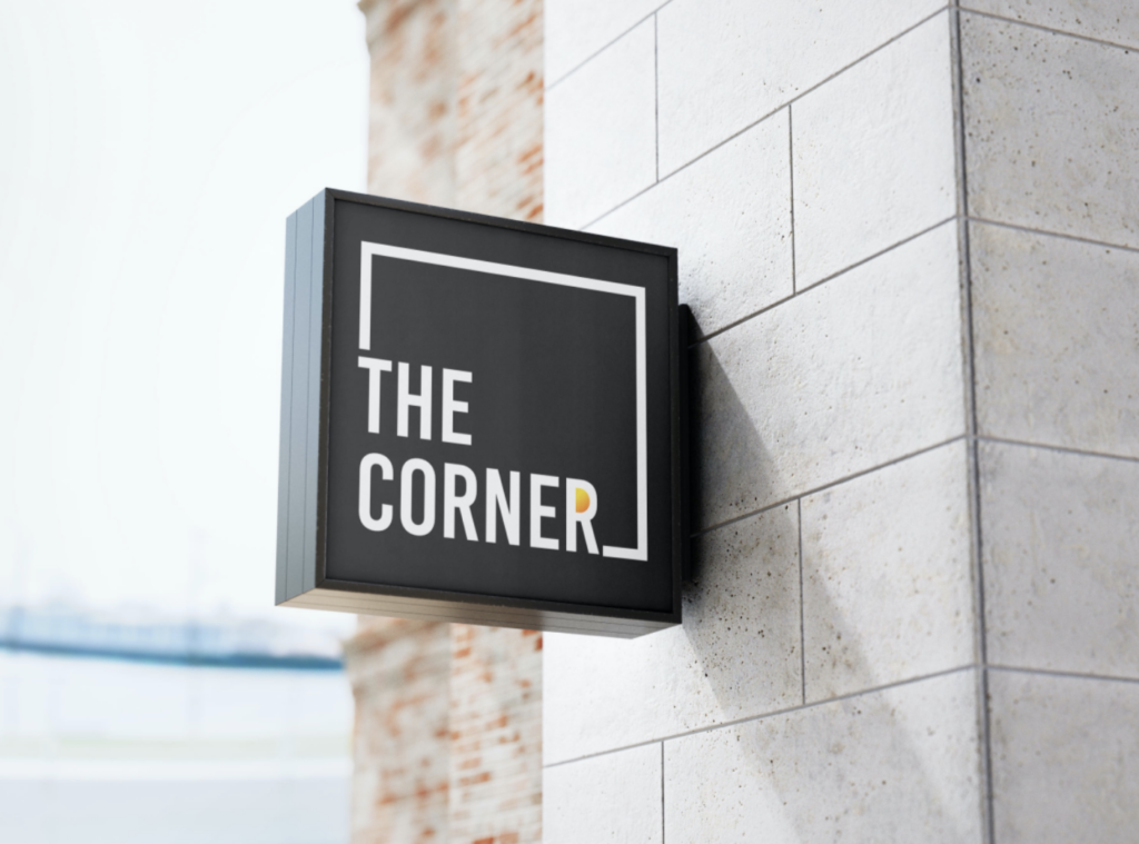
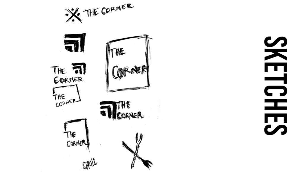
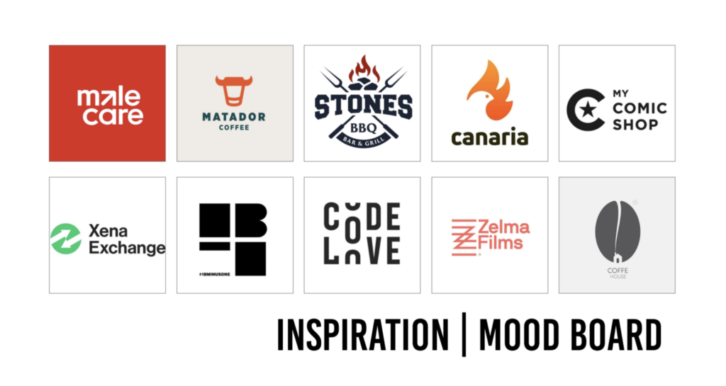
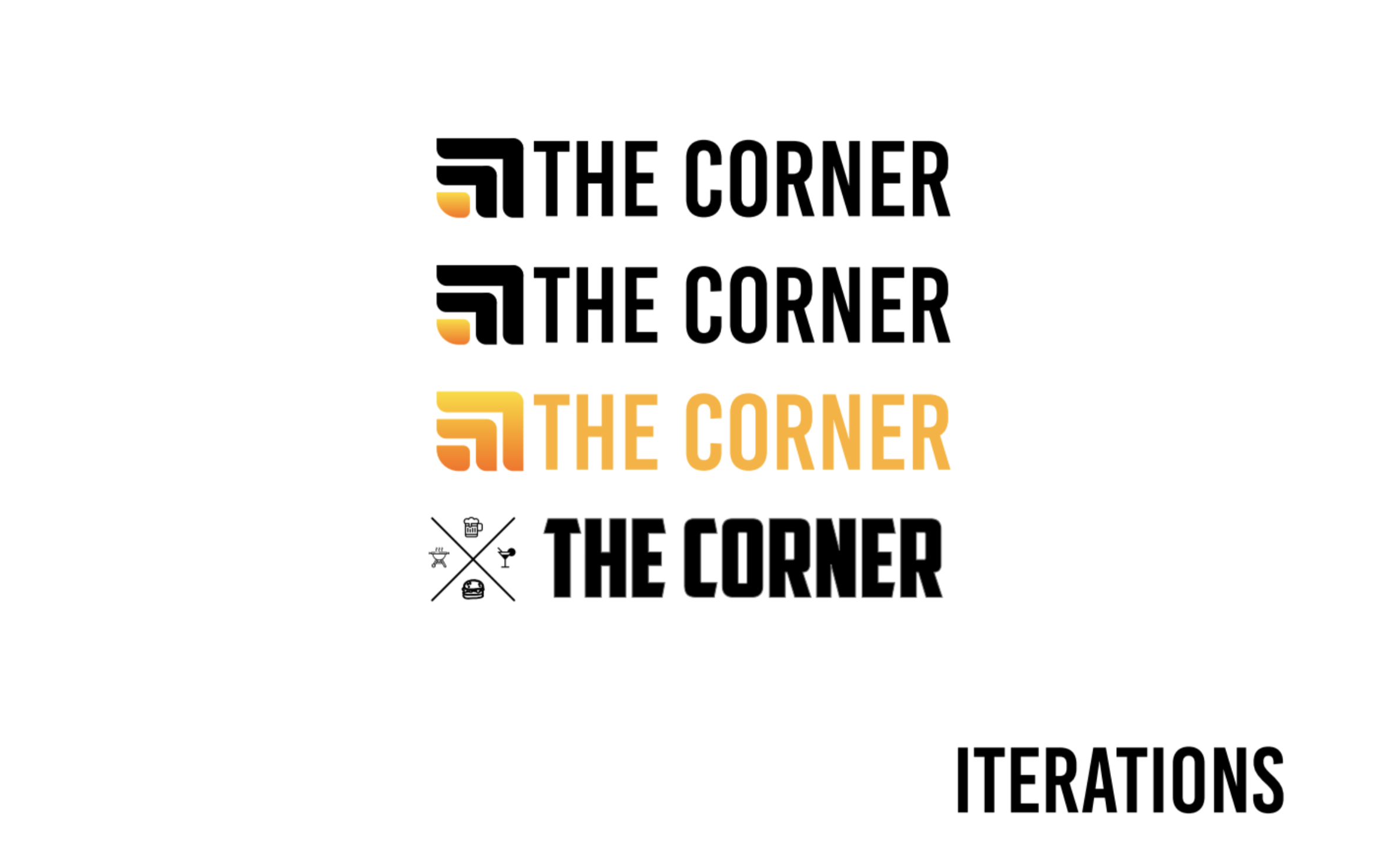
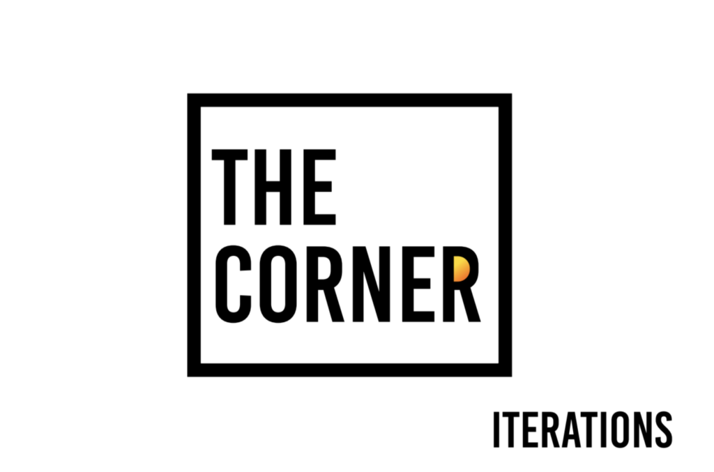
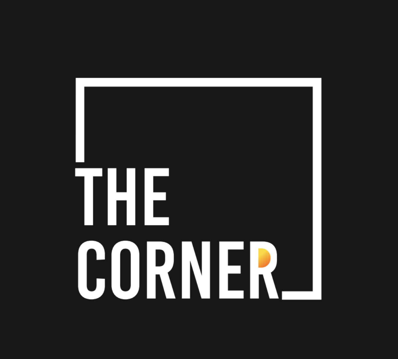
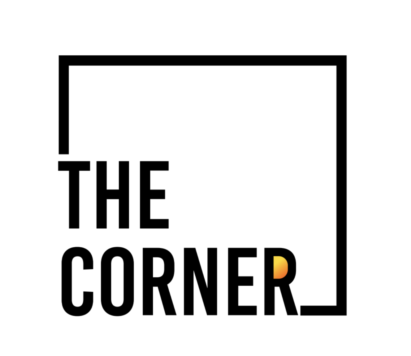
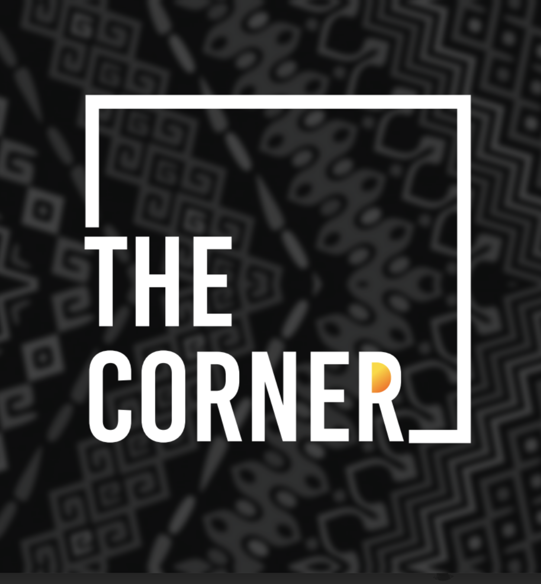
I aimed to avoid the typical restaurant logo clichés featuring plates, dishes, cutlery, or grills. My goal was to create something premium and simple that effectively conveyed the desired message. For inspiration, I explored various platforms such as Behance, Dribbble, and Instagram, seeking that spark to ignite my creativity. After reviewing numerous designs, I began sketching and digitally iterating on potential concepts. The final design is heavily typography-driven, with "THE CORNER" positioned in the bottom left corner of a square. A distinctive feature is the letter "R" in "corner," highlighted by a gradient from yellow to orange, enhancing its visual appeal. The logo leverages ample white space and high-contrast colors for simplicity and visibility, embodying a modern and sophisticated aesthetic.
Research
Critique
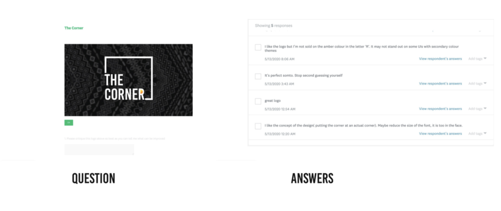
One of the major criticisms of the logo is the gradient fill in the letter "R," which affects its contrast on certain backgrounds. This is a significant issue that I plan to address in future designs. Additionally, the size of the typeface used for "THE CORNER" could be reduced slightly to make it less dominant and more visually appealing. Taking these considerations into account will enhance the logo's versatility and overall effectiveness.
Sketches
Moodboard
Colors
#FFD800- Yellow the Colour of optimism.
The brightness of yellow is particularly useful in catching the customer’s eye The colour of optimism. Yellow is a compelling colour that conveys youthful, fresh energy. This colour of sunshine is uplifting and illuminating and associated with success and confidence. Yellow stimulates the left side of the brain, helping with clear thinking and quick decision making. Yellow grabs attention because the eye sees yellow first. The downside of yellow is that it can induce anxiety and cause one to be over- critical.
#FF6C00- Orange the Colour of encouragement.
it’s often considered friendly and inviting. Also strongly associated with creativity
#000000- Black the colour of mystery.
Black is actually the lack of colour. It covers, hides and implies that there is a barrier. A strong and powerful colour, black is formal and sophisticated, sexy and secretive. It is the colour of things that are scary and evil. Black conveys pessimism and a lack of hope. While black has many negative associations, it is a colour that signifies power and control. It is considered unfriendly and intimidating, yet still refined, elegant and confident. Black is helpful to other colours, being a strong contrast and making them stand out more.
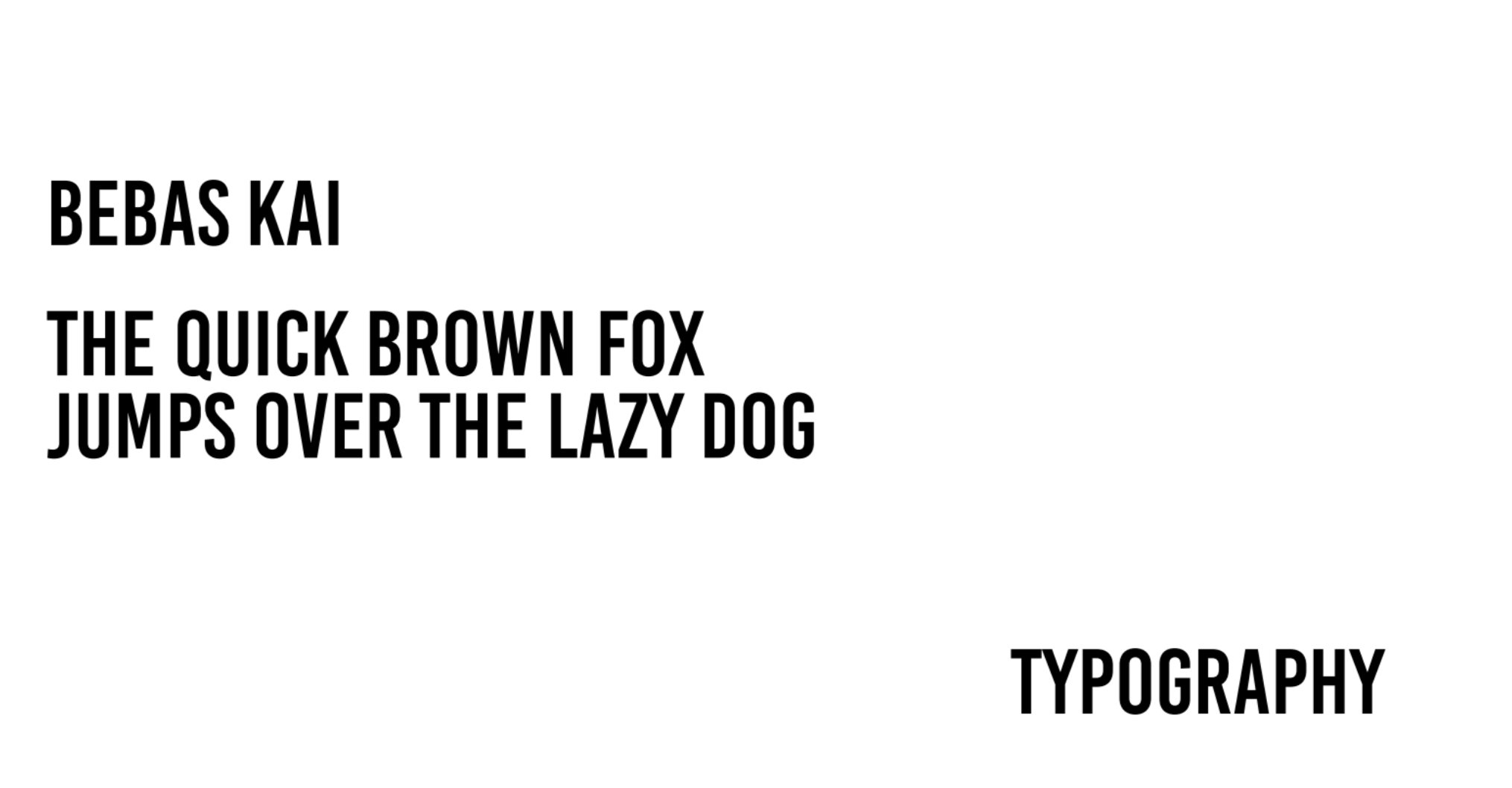
Typography
Iterations
final
Mockups

