Smartbox
Believing that life is more fulfilled through experiences than physical goods, Smartbox Group invented the concept of experience gifts, to offer unforgettable memories. In a world where people are more than ever looking for time for themselves, and are seeking meaningful relationships, offering someone the possibility to experience something rather than offering a material gift is the most valuable and thoughtful way to tell your loved ones you love them.
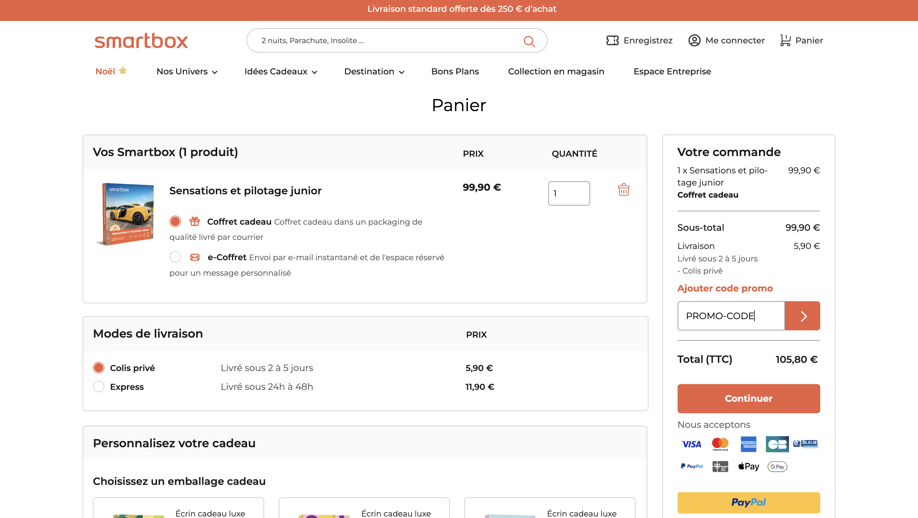
The PROBLEM
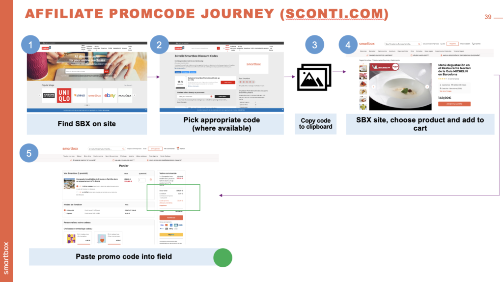
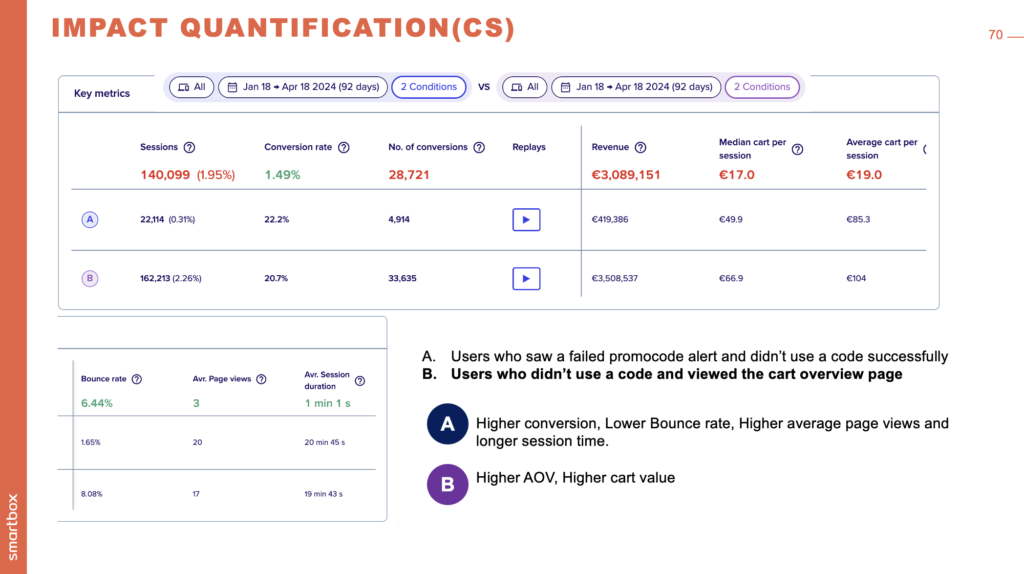
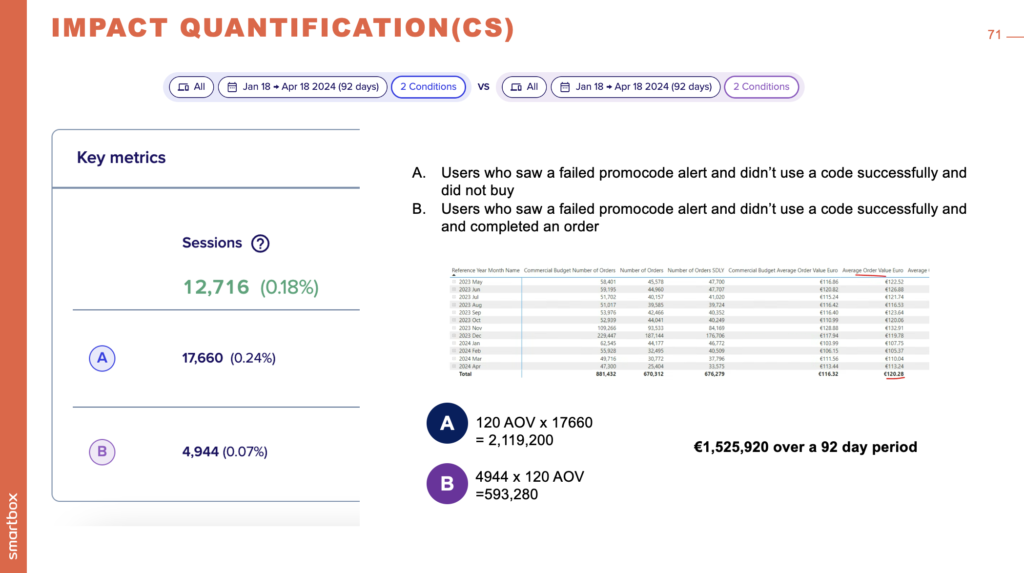
In the recent Cart abandonment research, promo codes were identified as a key area where user frustration leads to abandonment. Additionally, we’ve got outdated promo code journeys which don’t always match the business case for them (e.g. we’ve introduced some promo codes that don’t apply to all products, but the error/info messaging doesn’t easily handle it) This project aims to: Evaluate our current promo code ecosystem: How users find and try to apply promo codes: CRM (promo codes in different kinds of emails/newsletters or from affiliate sites/apps) Direct (promo codes on site, employee) User success/failure rate of redeeming promo codes Contentsquare / Power BI data on the effect of failed promo codes on our sales Propose an updated set of designs and user journeys to govern promo codes A schema for types and triggers of promo codes Designs for user scenarios, including error messaging
KEY INSIGHTS
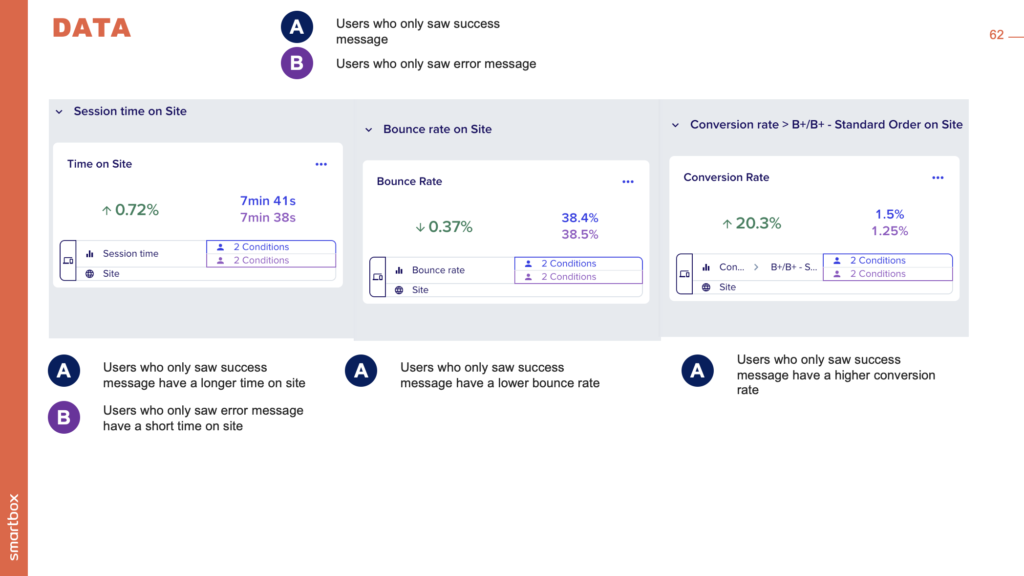
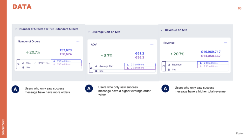
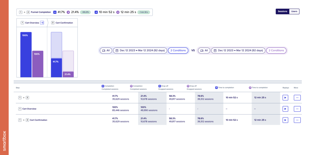
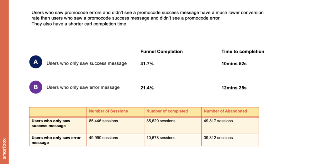
It's crucial to recognize the significant impact of successful promocode usage on user behavior and conversion rates. Data indicates that users who successfully apply a promocode exhibit a 20.3% higher conversion rate compared to those encountering errors. Furthermore, these users spend more time on the site and complete the purchase funnel 1 minute and 33 seconds faster, suggesting a smoother and more satisfying shopping experience. Additionally, users who successfully use a promocode tend to have a higher Average Order Value (AOV). However, the current system's conditional success messaging in the cart, which only appears under specific circumstances, may lead to confusion and frustration among users. Given that most competitors (4 out of 6) prominently display the promo code field, it's worth considering a similar approach to enhance visibility and ease of use. Notably, 5.73% of our business volume in the past four months from key markets like France, Italy, and Spain has involved promocodes, underscoring their importance. Optimizing the promocode experience could thus drive higher engagement and revenue, aligning with user expectations and industry standards.
User Journey
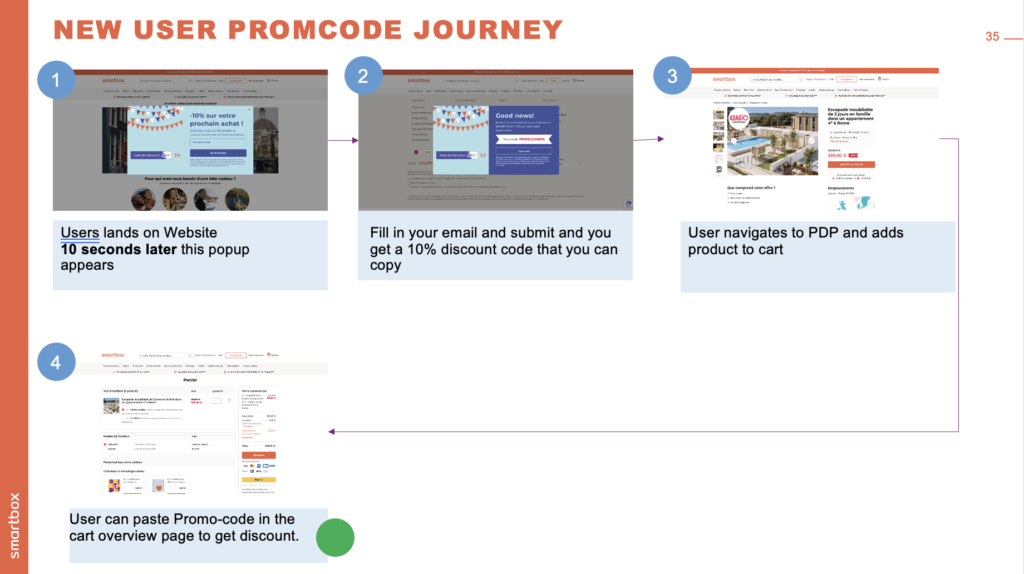
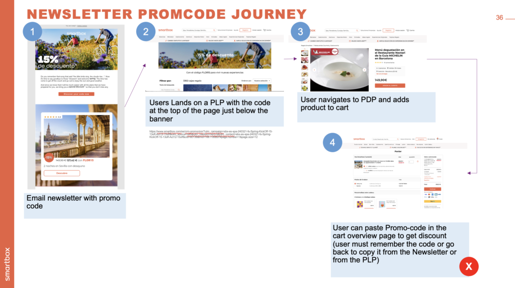
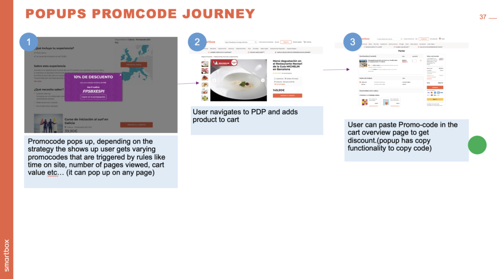
Competitor analysis
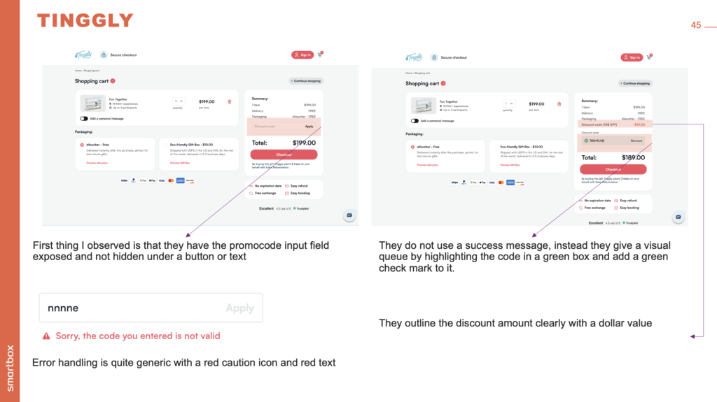
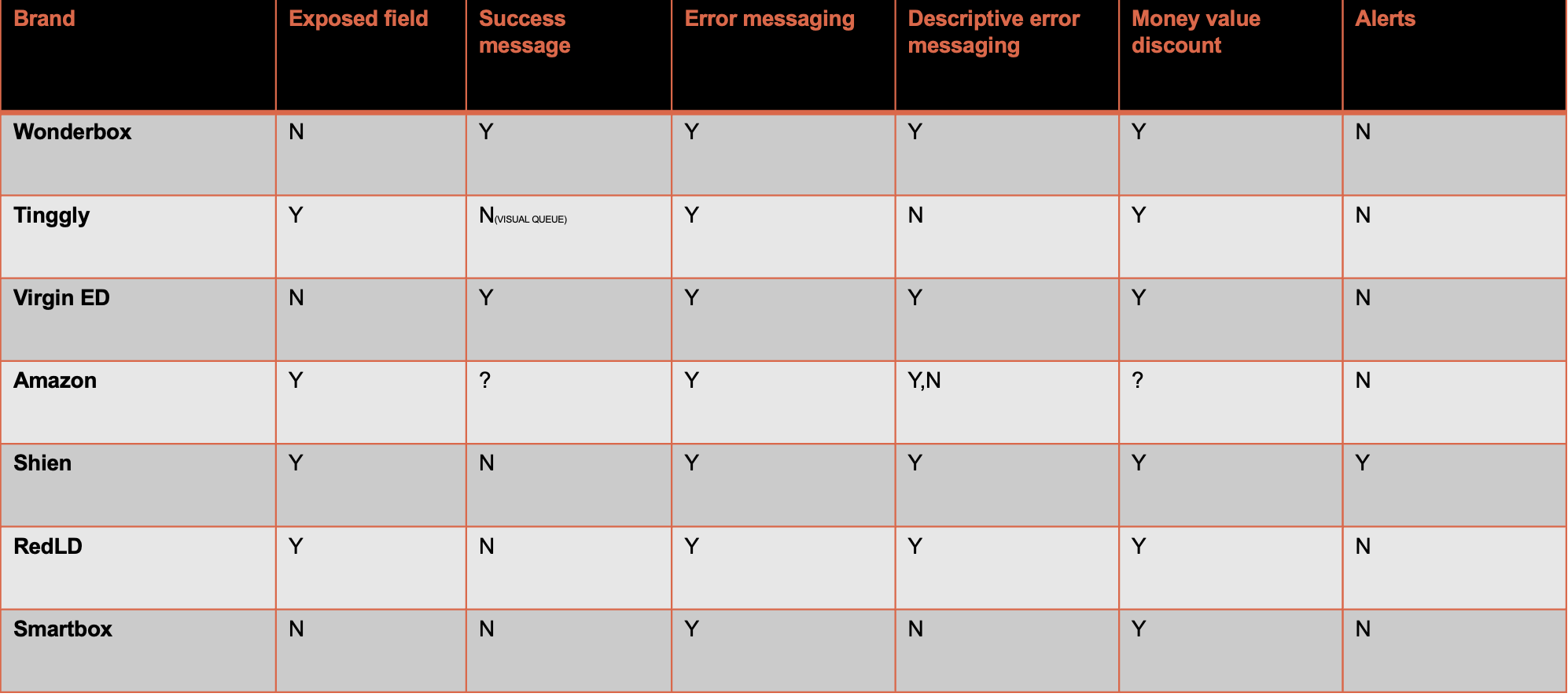
- 4 out of 7 brands had their promocode fields exposed and not hidden by an extra click or interaction
- 2 out of 7 brands had a clear and concise success message for user feedback
- 7 out of 7 brands had some type of error message to give the user feedback but but only 5 had a clear message for every scenario
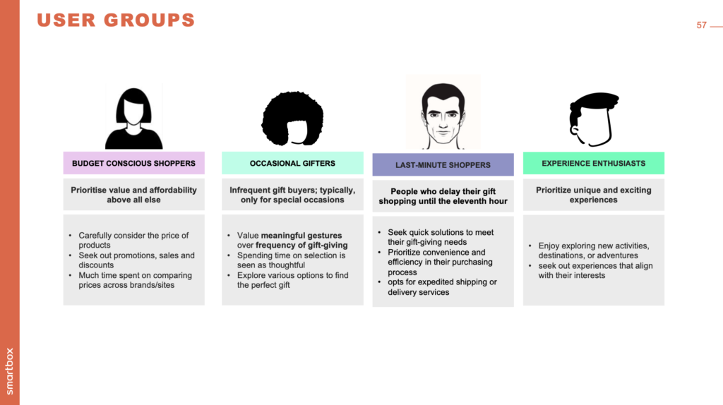
User Persona
DATA
CODE ERRORS
Data gotten from contentsquare on user behaviour and interaction
SOLUTION
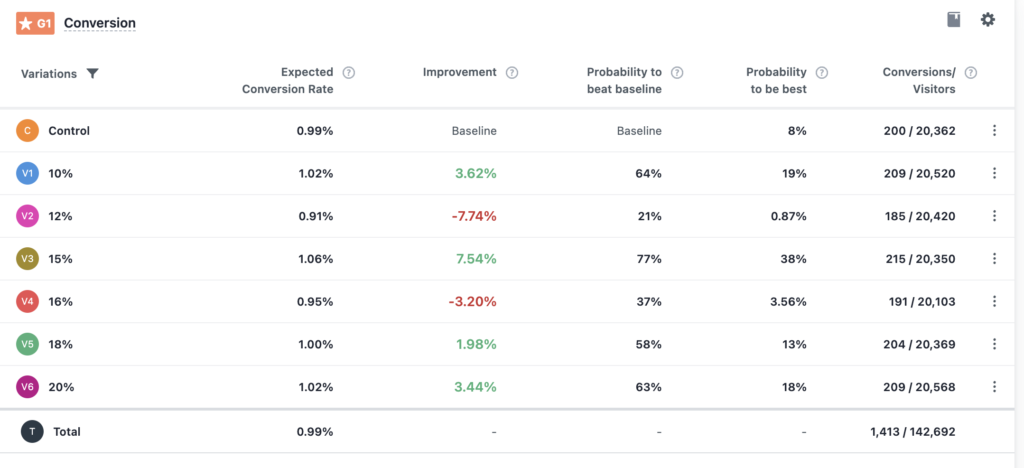
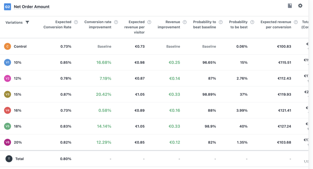
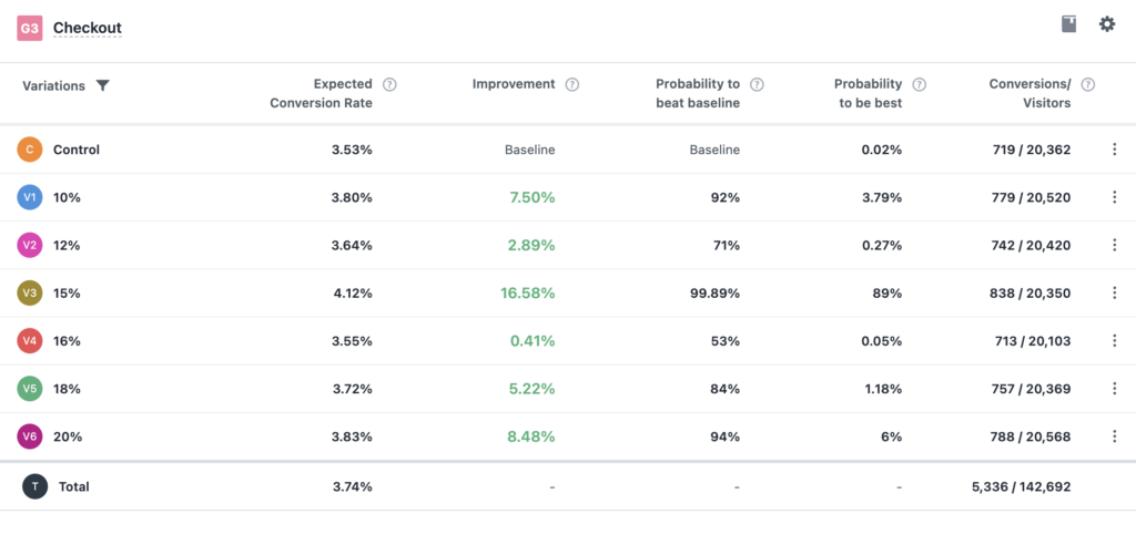
The first step was to make the codes readily available to the user at all times in the cart and all the pages leading up to the cart in the user journeyI decided to use a ribbon at the top of all the pages, I included a message and a code with a copy to clipboard functionality A/B testing this ribbon vs a control without the ribbon we created various discounts from 10% to 20% vs the control with no discount code

The Takeaway
Introducing a discount code, that is always present through the user journey increased the conversion rate by 7.50% at a 10% discount rate, which would be the best scenario from a business case, the lowest discount code converted a 7.50% above the control group
Next Steps
Next step is working on error handling when a user enters an invalid promo code or a code that does not work on certain products due to trade and cart rules, I need to run an A/B test to see how different error messages helps the user understand the problem and ultimately reduce user frustration and also reduce cart abandonment rates.