
Smartbox
Believing that life is more fulfilled through experiences than physical goods, Smartbox Group invented the concept of experience gifts, to offer unforgettable memories. In a world where people are more than ever looking for time for themselves, and are seeking meaningful relationships, offering someone the possibility to experience something rather than offering a material gift is the most valuable and thoughtful way to tell your loved ones you love them.
Client
[ Smartbox ]role
[ UX Designer / CRO Specialist ]Time Line
2025Live Project
[ visit website ]The Challenge
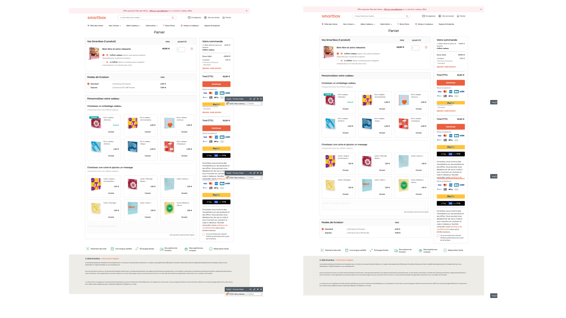
Smartbox's cart overview page had a high abandonment rate during the checkout process. User analytics revealed that the delivery widget placement might be causing unnecessary friction in the checkout flow. The primary concern was that the delivery widget was positioned prominently above the gift personalization options, potentially distracting users from the primary purchase path.
IMPACT
The Smartbox cart overview page redesign test confirmed that moving the delivery widget to the bottom of the page created a more effective checkout flow. This simple interface change streamlined the decision path, reduced cognitive load by repositioning less-frequently used options, and delivered statistically significant results with a 92% probability to beat the baseline. The test demonstrated that thoughtful UX optimization based on user behavior patterns can produce meaningful business outcomes without requiring extensive development resources. Implementing this change delivered tangible business benefits through a 1.94% improvement in cart-to-order conversion rate and a €0.54 increase in revenue per visitor—representing substantial additional completed purchases and revenue when scaled across Smartbox's high-volume traffic. Beyond metrics, the redesign improved the overall user experience by creating a more logical flow that better aligned with customer expectations and mental models of the checkout process, making the improvement beneficial for both business goals and customer satisfaction.
Research & Hypothesis
Observation
Analysis of user behavior showed low engagement with gift wrapping options compared to delivery methods. The delivery widget placement was potentially creating a distraction for users at a critical decision point in the checkout process.
Hypothesis
Moving the delivery widget from its prominent position to the bottom of the cart overview would increase conversion rates by:
- 1. Reducing distractions in the checkout flow
- 2. Presenting options in a more logical sequence
- 3. Creating a more streamlined path to purchase completion
The hypothesis was that since more users engage with delivery options than gift wrapping, having delivery options more prominent would increase checkout completion.
Testing Approach
I designed an A/B test using VWO’s testing platform to determine if repositioning the delivery widget would improve checkout performance:
- Control: Original design with delivery/shipping options positioned above the personalization block
- Variation: Modified design with the delivery/shipping block moved to the bottom of the cart overview
Test Setup
- Test Period: March 25 – April 22, 2025 (4 weeks)
- Target Pages: Cart overview pages (URL pattern: http*://checkout.smartbox.com//checkout/cart/)
- Primary Metrics: Overall conversion rate, cart-to-order conversion, click-through rate on continue button, revenue per visitor
- Secondary Metrics: Average order value, order quantity, gift wrapping usage, engagement
Results & Analysis
Primary Metrics Improvements
Overall Conversion Rate
- Control: 32.87%
- Variation: 33.33% (+1.41% improvement)
- 85% probability to beat baseline
Conversion from Cart to Order Confirmation
- Control: 33.26%
- Variation: 33.91% (+1.94% improvement)
- 92% probability to beat baseline
Click-Through Rate on Continue Button
- Control: 45.33%
- Variation: 45.70% (+0.84% improvement)
- 78% probability to beat baseline
Revenue Per Visitor
- Control: €36.29
- Variation: €36.83 (+€0.54 improvement)
- 76% probability to beat baseline
Secondary Metrics
- Average Order Value: Similar between variations (€105.73 vs €104.91)
- Order Quantity: 2.31% improvement with variation (35.04% vs 34.25%)
- Orders with Gift Wrapping/Message Card: Slight improvement of 0.66% with variation
- Engagement: Minor decrease (-0.08%) with variation, not statistically significant
The test results contradicted our initial hypothesis. The original orange button performed better for primary conversion metrics, suggesting:
- 1. The current orange color had better visibility than anticipated
- 2. Users were already familiar with the orange button
- 3. The alternative colors may have had lower contrast or visibility than expected
While the color variations showed improvements in engagement and beneficiary page views, these benefits did not translate to improved conversion rates.
KEY INSIGHTS
The test results confirmed our hypothesis about user flow optimization. Key findings include:
Streamlined Decision Path:
Moving the delivery widget to the bottom created a more logical purchase flow that matched users’ decision-making process.Reduced Cognitive Load:
By repositioning less-frequently used options, we reduced distractions during the critical checkout phase.Strong Statistical Significance:
The cart-to-order conversion improvement showed a 92% probability to beat the baseline, indicating strong confidence in the results.Minimal Design Change, Measurable Impact:
A relatively simple interface change produced meaningful business results without requiring significant development resources.
Business Impact
Based on the test results, implementing this change would yield significant business benefits:
- Increased Conversion Rate: The 1.94% improvement in cart-to-order conversion represents substantial additional completed purchases.
- Revenue Growth: An increase of €0.54 in revenue per visitor would scale to significant additional revenue across Smartbox’s high-volume traffic.
- Improved User Experience: The more logical flow aligns better with customer expectations and mental models of the checkout process.
Implementation & Recommendations
Following the successful test, I recommended:
Permanent Implementation: Apply the repositioned delivery widget design permanently across all markets and devices.
Further Checkout Optimization: Build on this success by testing additional refinements to the checkout flow, including:
1. Optimizing the presentation of delivery options
2. Enhancing the visual hierarchy of the continue button
3. Testing alternative placements for gift personalization options
User Journey Analysis: Conduct additional research into the complete purchase journey to identify other potential friction points.
Conclusion
This project demonstrated how targeted UX optimizations based on user behavior data can significantly impact conversion metrics. The successful repositioning of the delivery widget created a more intuitive checkout flow that better aligned with user expectations and decision-making processes.
The implementation of this design change represented a win-win for both Smartbox and its customers: users benefited from a more streamlined experience, while the business achieved measurable improvements in conversion rates and revenue.