Smartbox
Believing that life is more fulfilled through experiences than physical goods, Smartbox Group invented the concept of experience gifts, to offer unforgettable memories. In a world where people are more than ever looking for time for themselves, and are seeking meaningful relationships, offering someone the possibility to experience something rather than offering a material gift is the most valuable and thoughtful way to tell your loved ones you love them.
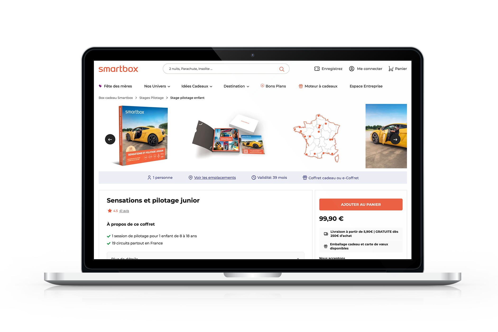
The Challenge
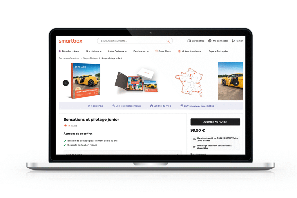
Smartbox's product pages featured an "Add to Cart" button in the company's primary orange color. The CRO team observed that the button might be blending too much with the overall design, potentially affecting conversion rates. The team hypothesized that a different color from the brand palette might create better visual distinction and improve user attention, leading to increased add-to-cart actions and conversions.
IMPACT
This test provided valuable data on user preferences and interaction patterns with CTAs on the Smartbox platform. While the original hypothesis was not supported, the project delivered clear evidence to inform future optimization efforts and prevent potential conversion losses from unnecessary design changes. The data-driven approach demonstrated the importance of testing assumptions before implementing changes, potentially saving Smartbox from a -3.95% to -8.14% decrease in conversion rates that would have resulted from changing the button color.
Research & Hypothesis
Observation
The current Add to Cart CTA used Smartbox’s primary orange color which risked blending in with the overall design, potentially reducing its visibility to users.
Hypothesis
Using an alternative bolder color from the brand palette would grab users’ attention more quickly and result in more clicks, improving both the add-to-cart rate and overall conversion rate.
Testing Approach
Testing Approach
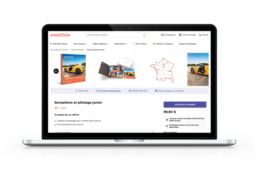
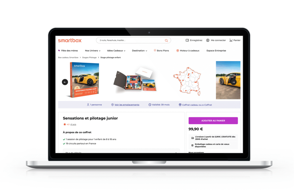
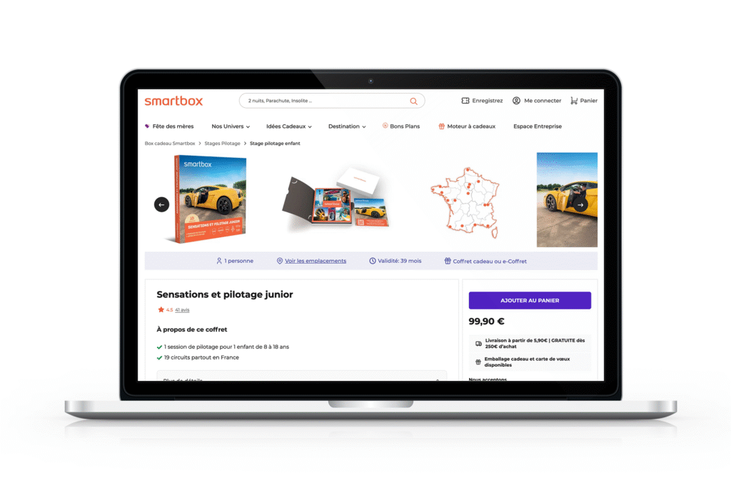
I designed a comprehensive A/B test using VWO’s testing platform, creating multiple variations to test against the original orange button:
- Control: Original orange button
- Variation 1: Dark Blue (
#4C509D) - Variation 2: Purple (
#7E2182) - Variation 3: Extra Night purple-blue (
#4F21C0) - Variation 4: Neutral/Black (
#1C1C1C)

Test Setup
- Launch Date: March 25, 2025
- Target Pages: Product pages (URL pattern: http*://checkout.smartbox.com//checkout/cart/)
- Primary Metrics: Conversion rate, Add to cart rate
- Secondary Metrics: Revenue, Engagement, Beneficiary page views
Results & Analysis
Primary Metrics Performance
Conversion Rate
The original orange button (control) had the highest conversion rate at 2.77%, while all variations underperformed:
- Dark Blue: 2.66% (-3.95% decrease)
- Purple: 2.66% (-4.10% decrease)
- Extra Night: 2.65% (-4.34% decrease)
- Neutral/Black: 2.55% (-8.14% decrease)
Add to Cart Rate
Similarly, the control outperformed all variations:
- Control (Orange): 9.32%
- Dark Blue: 9.28% (-0.42% decrease)
- Purple: 9.17% (-1.65% decrease)
- Extra Night: 9.05% (-2.85% decrease)
- Neutral/Black: 9.18% (-1.51% decrease)
Secondary Metrics
While the primary conversion metrics favored the original orange button, we discovered some interesting patterns in secondary metrics:
- Engagement: Neutral/Black (+0.59%) and Dark Blue (+0.44%) variations slightly outperformed the control
- Beneficiary Page Views: All variations performed better than the control (+0.71% to +2.01%)
- Revenue per Visitor: The Extra Night variation showed a slight improvement (+€0.08) despite lower conversion rates
The test results contradicted our initial hypothesis. The original orange button performed better for primary conversion metrics, suggesting:
- 1. The current orange color had better visibility than anticipated
- 2. Users were already familiar with the orange button
- 3. The alternative colors may have had lower contrast or visibility than expected
While the color variations showed improvements in engagement and beneficiary page views, these benefits did not translate to improved conversion rates.
Conclusion & Recommendations
Based on the comprehensive test results, we recommended retaining the original orange button as the default color for “Add to Cart” CTAs. The test revealed valuable insights about user behavior and expectations on the Smartbox platform.
Recommendations for Future Tests:
- 1. Consider testing button size and positioning rather than color
- 2. Explore ways to improve the contrast and visibility of the existing orange button
- 3. Test different button text or iconography while maintaining the original color
- 4. Conduct qualitative user testing to better understand how users interact with CTAs
Appendix
Neutral
Default – #1C1C1C
Hover – #3D3D3D
Text color – #FFFFFF
Dark blue
Default – #4C509D
Hover – #3B3B6D
Text color – #FFFFFF
Purple
Default – #bb33c6
Hover – #7E2182
Text color – #FFFFFF
Extra night
Default – #4F21C0
Hover – #7a5af8
Text color – #FFFFFF